When will the 3.5" floppy stop being used as an icon for saved data?
I think its cool, but…Do kids even know what these things are???
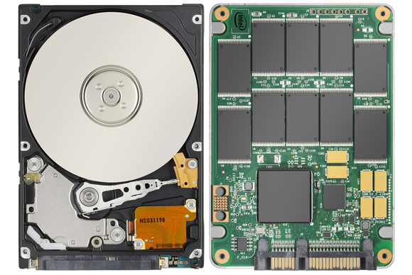
It’s pretty outmoded at this point. Why not a usb stick… Or…a CD…. Or….a memory stick?
Observing members:
0
Composing members: 0
Composing members: 0
Answers
Tropical_Willie
(31124 )“Great Answer”
(4)
)“Great Answer”
(4)
RandomGirl
(3362)“Great Answer”
(0)
gorillapaws
(30518)“Great Answer”
(2)
Seiryuu
(254)“Great Answer”
(1)
fundevogel
(15506)“Great Answer”
(4)
ragingloli
(51966)“Great Answer”
(3)
Ltryptophan
(12091)“Great Answer”
(2)
Lightlyseared
(34622)“Great Answer”
(1)
rexacoracofalipitorius
(2985)“Great Answer”
(1)
jerv
(31076)“Great Answer”
(0)
poisonedantidote
(21675)“Great Answer”
(2)
ragingloli
(51966)“Great Answer”
(1)
RealEyesRealizeRealLies
(30951)“Great Answer”
(2)
Crumpet
(1805)“Great Answer”
(0)
gorillapaws
(30518)“Great Answer”
(3)
rojo
(24179)“Great Answer”
(1)
RandomGirl
(3362)“Great Answer”
(0)
